Most of my clients self-publish, and I know they don’t realize they should have an author website.
Even if it’s simply a landing page, about page, and book page, authors need a website.
And your landing page, as well as your entire site, should be focused on a specific site related keywords. This includes your domain name, the title, headlines, content, and so on. Having a specific keyword and site focused website improves search engine optimization and increases your online authority. It also makes it easier for people interested in your site’s topic to find you.
There are 10 Must-Have Author Website Elements. Do you have them all in place?
1. THE HEADER.

Your header should be relevant to your site’s brand (the site's overall color scheme and feel); it needs to help visitors quickly grasp what the site is about. Along with this, the header should be professionally done.

If you use a theme that doesn’t allow for a header or has a very small header, you might not be able to take advantage of a professional header. If this is the case, it'd be wise to choose a different theme.

An example of this is my site’s header. You can see it at the top of the page.

It tells exactly what the site is about. I used to have an orange theme, but have since updated the look.

Interestingly, I had clients who said they hired me because of the other coloring. But this new look is much more professional and clean. You can see an image of the old header below.

2. THE TITLE.

You need an effective, optimized title. Your title should be keyword-effective and further cement the focus of your site for the visitor. As with any title, it should grab readers and let them know what to expect.

Having an optimized title means using words that will tell the search engines and people what your site is about

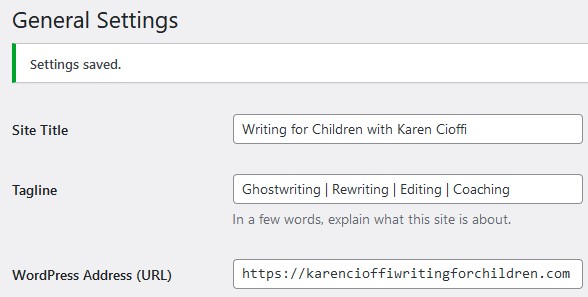
The title can go in two places: in Settings in your WordPress dashboard, and in the Header Image you create or have created.

I mentioned it can go in both places, but it doesn’t have to.

The title of my site is Writing for Children with Karen Cioffi.

While I have a lot of helpful articles on writing for children on my site and I post weekly, the primary purpose of my site is to offer services. The title in the header reflects this.
3. THE SUBTITLE.

An effective subtitle lets you can elaborate on the title and add more relevant site information.

My header subtitle is the same as it is in my Settings (the Tagline in the #2 above image).

It’s important to keep in mind that images have no SEO juice, meaning search engines can’t read the text in images. But you can add a title and description to the images in the Metadata area after you upload the image.

In any place you can add keywords or a description in WordPress or any other Content Management System, do so.

4. WEBSITE NAVIGATION

Navigation primarily concerns your site’s menu. It’s what gets a visitor to your site from one page to another.
The navigation must be quick to see and easy to use. And, it must be above the fold, which means it must be immediately visible upon landing on the site.

Most sites have the menu just below the header, but some have it on the sidebar. If yours is on the sidebar, it should be above the fold.

Your menu needs to be quickly seen and functioning properly.

5. ABOUT PAGE.

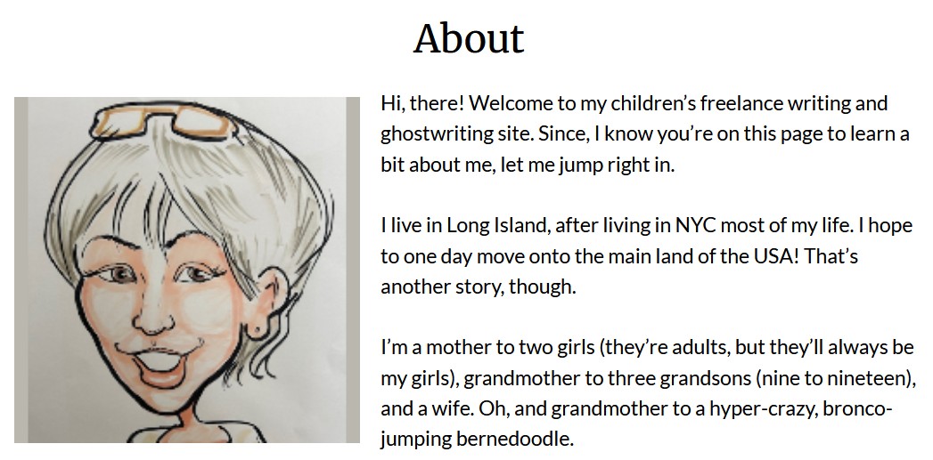
Every site needs this page. Visitors want to know who you are, what you’re offering, and why you’re qualified to provide it. Don’t make it a guessing game or make the visitor have to search to find out who runs the site.

To make the page friendly, keep the content on this page conversational. You can give some personal information, but not too much. The internet isn’t the safest place, so be careful. You should also include a headshot.
6. CONTACT PAGE AND OTHER WAYS TO BE REACHED.

You need easy-to-find contact information on the Landing Page and all the other pages. A potential customer or client doesn’t want to search for information on how to contact you with questions or a project. Have your contact information on every page (the sidebar or the bottom of each page work well).

This is especially important if you offer services.
Aside from the Contact Page, I have my contact info on the sidebar right below my call-to-action (CTA).

I’ve used a contact form in the past, but it caused problems on my site (according to Bluehost, my hosting service), so I removed it.

Below is what I have on my contact page:
7. RESPONSIVE THEME.

With all the devices your website can be seen on, you need a responsive theme that morphs (automatically adjusts) to all formats: websites, laptops, iPads, smartphones, etc.

To check how your site looks on any device, visit http://ipadpeek.com. If your site doesn’t measure up, search for a theme that works.

Google actually frowns upon sites that aren’t responsive.

8. OPT-IN.

You absolutely need an opt-in to your mailing list. The mailing list is considered ‘golden’ and is the marketing tool that will help you build a relationship with your visitors and readers.

It’s this ongoing relationship that builds trust, authority, and conversion (having someone take action – buy your book or hire you).

While you should have an opt-in for your mailing list, it may also be to bring a visitor to a sales page for your books or services, or to sign up for a webinar or eclass. Whatever you’re offering and want your visitor to take action on, use an opt-in.

The opt-in should be above the fold and in line with your color scheme.

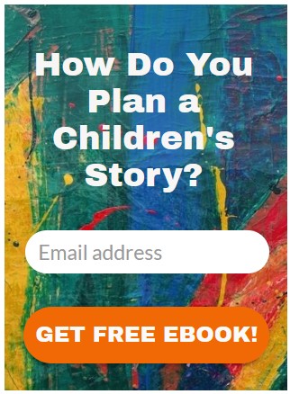
My opt-in is at the top of my sidebar:
9. ETHICAL BRIBE.

The most effective tool to get a visitor to subscribe to your opt-in is the ‘ethical bribe.’ This offering should be something of perceived value to your target market that will entice visitors to sign up. The above image is an example of an opt-in freebie.

Your ethical bribe should include a clear call to action (CTA), so visitors will know what you want them to do.

In the image above, the opt-in is for my mailing list, and the ethical bribe is “How Do You Plan a Children’s Story?” The clear CTA is “Get Free EBook.”

10. FOCUS AND SIMPLICITY.

I mentioned focus earlier. Your site needs to be focused.

If your site is about writing for children, you wouldn’t write about romance novels or offer them for sale on the site.

Google pays attention to the focus of your site. If you dilute that focus with unrelated content and offerings, Google will most likely avoid using your site in search results.

Notice how my site’s keywords are specific to children’s ghostwriting and writing for children.

This focus helps search engine spiders and visitors quickly understand what the site is about.

The next thing is simplicity. People have super-short attention spans. You need to make things as simple as possible for the visitor to quickly know what you’re offering and how they can get it.
I’m a working children’s ghostwriter, editor, and coach. I can help turn your story into a book you’ll be proud to be the author of, one that’s publishable and marketable.
OTHER HELP I OFFER:
FICTION WRITING FOR CHILDREN COURSE
A guided self-study course and mentoring program.
HOW TO WRITE A CHILDREN’S FICTION BOOK
A DIY book to help you write your own children’s book.
WRITERS ON THE MOVE SELF-PUBLISHING SERVICE
Self-publishing help for children’s authors
(Picture books and chapter books)
You can contact me at: kcioffiventrice@gmail.com.

Put Your Characters Behind the Wheel: Character Agency

Back-End vs. Backlist Book Marketing

How Do I Sell My Books?


2 thoughts on “Author Website Must-Have Elements”